A MORE DEADLY UNION.
Perfect, trust me. Once I had the title, I could start Joe Felipe on the cover art. It took us our normal three rounds to come up with something I liked.

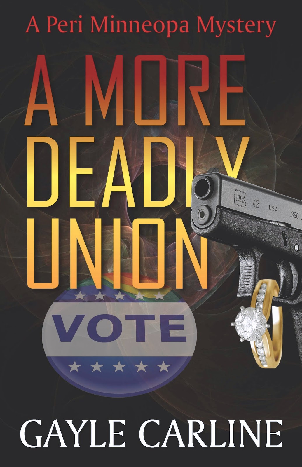
I love the symbols used, in that the story covers an election, marriage, and quite a bit of shooting. When I placed my order with Joe, I said the cover needed to reflect the previous books in the series. He followed my request faithfully, down to the block lettering in the title.
The problem is, I find the block lettering boring. So I asked him to come up with some alternatives. Here's what he did, along with a note that he could make the letters any color that suited my fancy.

Cover 1

Cover 2
Cover 3

Cover 4
Which one do you prefer? Don't be shy - you can let me know in the comments here or in social media. I need all the help I can get.
Just a thought....I don't think the gun should cover any part of the title...I think the title needs to stand alone and boldly...like the print og the first one...
ReplyDeleteI like the one with the boldest font best, except the gun blocks out the L & Y... But then reducing the size of the gun or moving it elsewhere on the cover might undermine the effect you're going for...
ReplyDeleteI like cover 4, but agree maybe the gun could be slightly re-positioned. The title still registers even with the gun blocking a few letters though. My brain supplied what was missing.
ReplyDelete