Extra points for the movie this post's title is from.
I've been a busy bunny these past many months, trying desperately to finish the 5th Peri mystery, give it a name, and prepare for its debut. At times, I thought it would never happen. At times, I was willing to "half-ass" it, throw it all together, shrug, and release it without much fanfare.
But reason prevailed.
I can't release a book I'm not proud to have written. There are a couple of books among the ones I've published that are not my favorites, but I'm not ashamed to have my name on the covers. The more I edited this novel, the more I fell in love with it, and the more justice I wanted to do to the story.
The current status is:
1. It's in its final phase with my lovely and talented editor, Jennifer Silva Redmond.
2. It has a title.
3. It has a jacket teaser (that probably still needs tweaking).
4. I have four strong contenders for the cover art. This is where you come in. Take a gander at the cover options I'm considering and let me know your preference. BTW, we can mix and match fonts and colors if you think there's a better combo.
People of Earth, I give you:
MURDER BYTES
P.I. Peri Minneopa has had enough. She’s closing her business, marrying her detective boyfriend, and settling down to a life of ease–until her brother shows up, accused of a murder he swears he didn’t commit. Now she’s back in the thick of things, investigating the death of an engineer who may have been stealing techno-secrets from other companies. Her relationship with her brother is an icy one, at best, and she struggles with her ambivalence, as well as her desire to leave investigative work behind. Digging around in people’s lives is reasonably easy, but when the bullets start flying, will Peri be able to keep her promise?
Cover Option 1
Cover Option 2
Cover Option 3
Cover Option 4
Look for one of these covers, and more Peri Minneopa to come your way February 2020!
"The notion that such persons are gay of heart and carefree is curiously untrue. They lead, as a matter of fact, an existence of jumpiness and apprehension. They sit on the edge of the chair of Literature. In the house of Life they have the feeling that they have never taken off their overcoats."
- James Thurber, My Life and Hard Times
Showing posts with label cover art. Show all posts
Wednesday, July 3, 2019
Friday, January 29, 2016
I got you covered
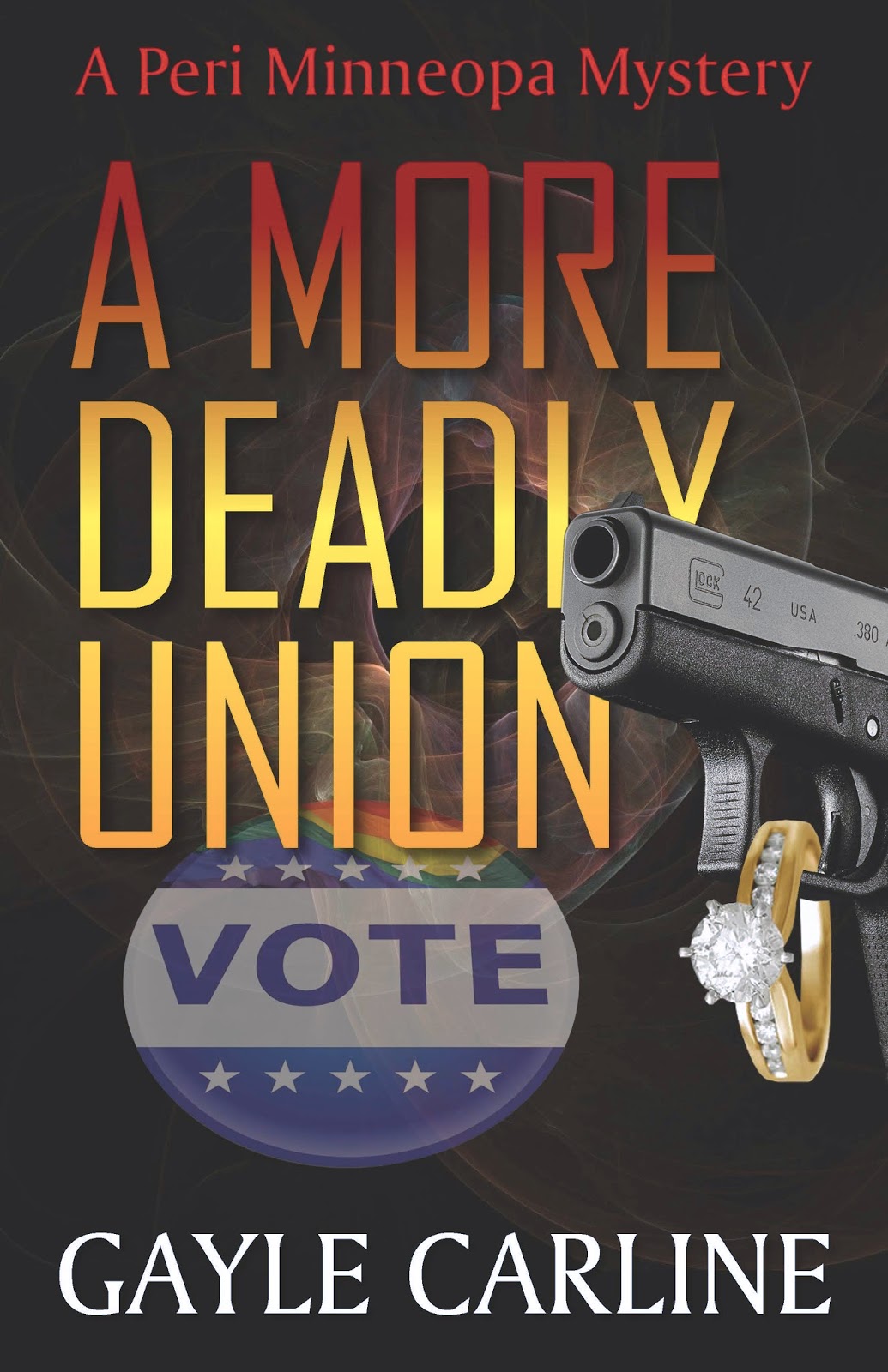
Good news, Peri lovers! The fourth book is in the editing and design phase. It was a difficult story and I had to wrestle it into submission at several points, but I'm satisfied with the results. I thought it was going to take me as long to think of a title as it did to write the darn thing. Fortunately, my editor and friend, Jennifer Silva Redmond began throwing phrases my way, which led me to other phrases, which eventually led me to:
A MORE DEADLY UNION.
Perfect, trust me. Once I had the title, I could start Joe Felipe on the cover art. It took us our normal three rounds to come up with something I liked.
I love the symbols used, in that the story covers an election, marriage, and quite a bit of shooting. When I placed my order with Joe, I said the cover needed to reflect the previous books in the series. He followed my request faithfully, down to the block lettering in the title.
The problem is, I find the block lettering boring. So I asked him to come up with some alternatives. Here's what he did, along with a note that he could make the letters any color that suited my fancy.
Which one do you prefer? Don't be shy - you can let me know in the comments here or in social media. I need all the help I can get.
A MORE DEADLY UNION.
Perfect, trust me. Once I had the title, I could start Joe Felipe on the cover art. It took us our normal three rounds to come up with something I liked.
I love the symbols used, in that the story covers an election, marriage, and quite a bit of shooting. When I placed my order with Joe, I said the cover needed to reflect the previous books in the series. He followed my request faithfully, down to the block lettering in the title.
The problem is, I find the block lettering boring. So I asked him to come up with some alternatives. Here's what he did, along with a note that he could make the letters any color that suited my fancy.
Cover 1
Cover 2
Cover 3
Cover 4
Which one do you prefer? Don't be shy - you can let me know in the comments here or in social media. I need all the help I can get.
Thursday, January 9, 2014
It don't come easy
For anyone out there who thinks that self-publishing is a shortcut for people who don't want to spend the quality time seeking out representation, hoping to get a publisher, then sitting back and waiting two years to see their book on the shelves, let me tell you something:
If it is, I'm doing it wrong.
In September, I completed my manuscript, Murder on the Hoof. So far, I've edited it myself 5 times, sent it to beta readers and incorporated their comments, sent it to my freelance editor for additional, professional editing, and worked with my cover designer.
Believe it or not, the cover's been the hardest part of this particular book. For some reason, Joe (Felipe, my cover designer whom I adore) and I could not come up with a design that worked. We started the work in November, for Pete's sake, and just kept swapping this for that for the other thing. It was much like getting dressed to go someplace a little more upscale than you usually visit - you put on an outfit, then change the top, then the bottom, then the top again, and so on until you find that combination that works.
When I opened Joe's email today, I nearly wept. It was soooo good.
Ladies and Gents, I give to you...
Isn't lovely? I still have to write the jacket blurb, but first I have to get my editor's comments folded in. My author's heart is getting really excited. My publisher's heart is saying, "Calm down. We're a long way from a release party."
If it is, I'm doing it wrong.
In September, I completed my manuscript, Murder on the Hoof. So far, I've edited it myself 5 times, sent it to beta readers and incorporated their comments, sent it to my freelance editor for additional, professional editing, and worked with my cover designer.
Believe it or not, the cover's been the hardest part of this particular book. For some reason, Joe (Felipe, my cover designer whom I adore) and I could not come up with a design that worked. We started the work in November, for Pete's sake, and just kept swapping this for that for the other thing. It was much like getting dressed to go someplace a little more upscale than you usually visit - you put on an outfit, then change the top, then the bottom, then the top again, and so on until you find that combination that works.
When I opened Joe's email today, I nearly wept. It was soooo good.
Ladies and Gents, I give to you...
Isn't lovely? I still have to write the jacket blurb, but first I have to get my editor's comments folded in. My author's heart is getting really excited. My publisher's heart is saying, "Calm down. We're a long way from a release party."
Tuesday, April 3, 2012
Who can I turn to?
Why, all y'all, of course. Remember when I had to pick a cover for Hit or Missus and I was feeling woefully indecisive and lacked confidence? Who helped me? You did. You gave me your opinions and I ended up picking a killer cover.
Now I've got to pick a new cover for Freezer Burn, because I'm re-releasing it myself. It's harder this time than the last, because I've got the old cover stuck in my head. I loved my old cover, but not only do I think I don't get the rights to use that, but I want my covers to look like they go together. I want a "brand." And as much as I love my old cover, people tend to gravitate toward the Hit or Missus cover, so clearly the public has an opinion.
After working with my cover designer, whom I adore, I've got four choices. I suppose I could just put a voting poll at the side, but I never get any votes when I do that. All people ever do is leave comments, either here or on Facebook. So take a look and tell me what you think.
COVER 1:
COVER 2:
COVER 3:
COVER 4:
I'm actually partial to one of these, but I won't tell you which. Instead, you pick one and tell me why.
Now I've got to pick a new cover for Freezer Burn, because I'm re-releasing it myself. It's harder this time than the last, because I've got the old cover stuck in my head. I loved my old cover, but not only do I think I don't get the rights to use that, but I want my covers to look like they go together. I want a "brand." And as much as I love my old cover, people tend to gravitate toward the Hit or Missus cover, so clearly the public has an opinion.
After working with my cover designer, whom I adore, I've got four choices. I suppose I could just put a voting poll at the side, but I never get any votes when I do that. All people ever do is leave comments, either here or on Facebook. So take a look and tell me what you think.
COVER 1:
COVER 2:
COVER 3:
COVER 4:
I'm actually partial to one of these, but I won't tell you which. Instead, you pick one and tell me why.
Subscribe to:
Posts (Atom)